
Is your Website Mobile-Friendly?
March 14th, 2023

In today's digital age, having a mobile-friendly website is crucial for any business that wants to succeed online. With the increasing number of people using their mobile devices to browse the internet, it's more important than ever to optimize your website for mobile devices. In this blog post, we'll discuss some key tips for making your website mobile-friendly.
Use a Responsive Design- Responsive design is a design technique that allows your website to adjust its layout according to the screen size of the device it is being viewed on. This means that your website will look good and function well on any device, whether it's a desktop, laptop, tablet or mobile phone. By using a responsive design, you can ensure that your website is mobile-friendly and provides a great user experience.
Simplify Navigation- When designing a mobile-friendly website, it's important to keep in mind that users are likely to be browsing on a small screen. This means that you need to simplify your website's navigation to make it easier for users to find what they're looking for. Try to limit the number of menu items and use clear and concise labels. Use drop-down menus or accordion-style menus to save space and make navigation more user-friendly.
Optimize Your Images- Images can significantly slow down your website's load time on mobile devices, which can negatively impact the user experience. To optimize your images for mobile devices, make sure to compress them to reduce their file size without sacrificing quality. You can also use lazy loading, which only loads images when they are needed, to reduce the amount of data being downloaded.
Use Mobile-Friendly Fonts- Fonts can also impact the user experience on mobile devices. Some fonts may look great on a desktop screen but may be difficult to read on a small mobile screen. Choose fonts that are easy to read on mobile devices and use a font size that is large enough to be read without zooming in.
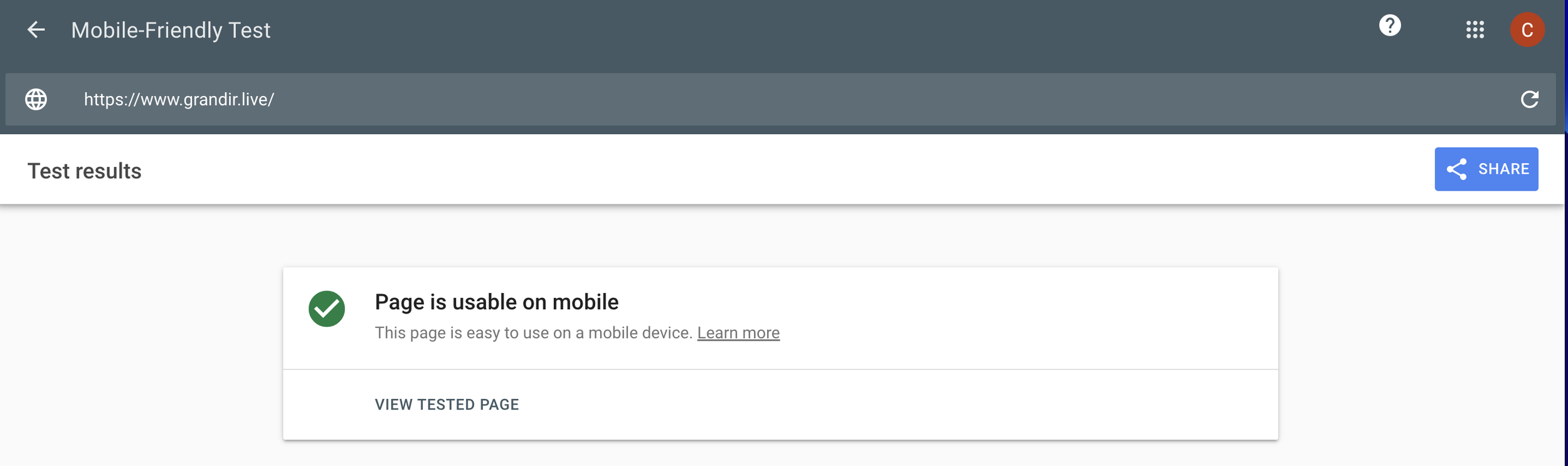
Test Your Website on Mobile Devices- Finally, it's important to test your website on mobile devices to ensure that it looks and functions correctly. Use tools like Google's Mobile-Friendly Test to check whether your website meets the mobile-friendly criteria. You can also ask your friends or colleagues to test your website on their mobile devices and provide feedback.

In conclusion, making your website mobile-friendly is essential in today's digital landscape. By using responsive design, simplifying navigation, optimizing your images, using mobile-friendly fonts, and testing your website on mobile devices, you can ensure that your website provides a great user experience and helps your business succeed online. As always, we are on your team. Let us know how we can help.